
BNP Paribas PF & Creation Finance
Accessibility Auditing
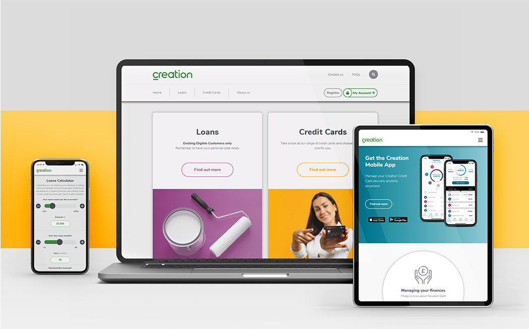
Haywyre has always prioritised functionality and ensuring our websites are accessible to everyone. Recognising the growing focus on online accessibility and in conformance to increasing industry standards, we’ve begun yearly audits of some of our older projects, starting with BNP Paribas Personal Finance and Creation Finance. This proactive approach underscores our commitment to continually improving accessibility standards and ensuring an inclusive online experience for everyone.
BNP Personal Finance
Company Profile
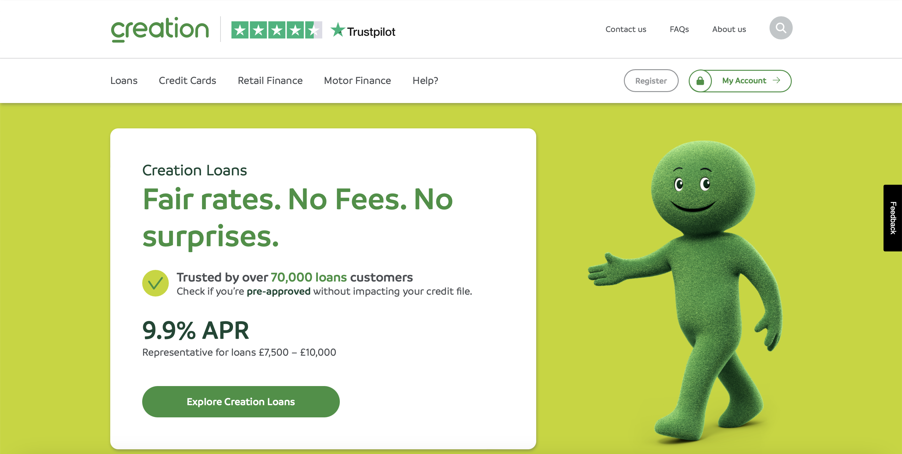
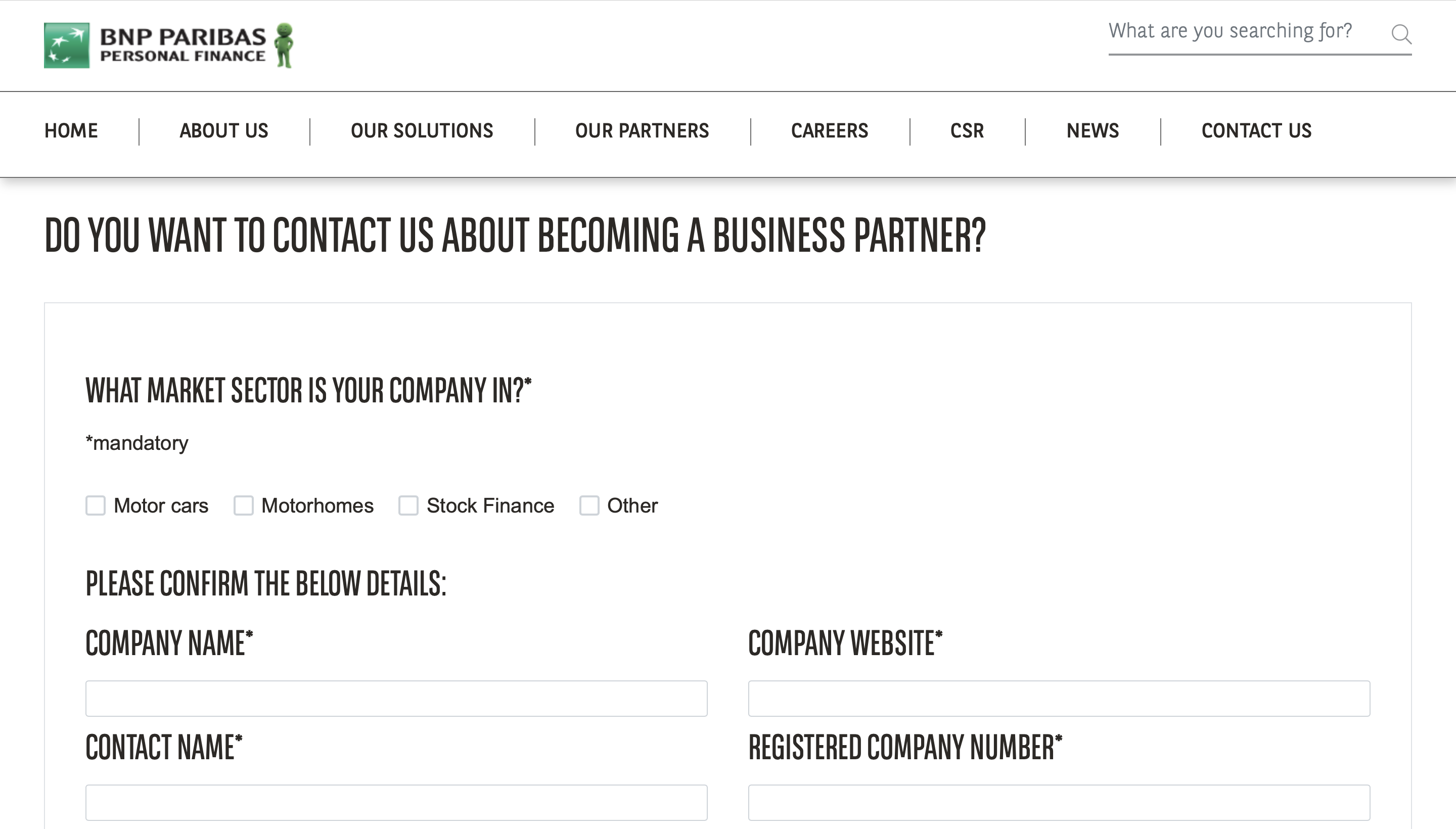
BNP Paribas Personal Finance is the power behind some of the UK’s best-known high street brands through its consumer arm, Creation. It provides a range of retail finance, credit cards and loans to over four million customers on behalf of more than 200 organisations. It is a 100% subsidiary of global banking group BNP Paribas, one of the strongest banks in the world. Haywyre has been a web development partner, developing and support the Creation web presence since 2001.
Details
Website: bnpparibas-pf.co.uk, creation.co.uk
Industry: Finance
Platform: Web
Services: Accessibility, UX design, web development
Project Date: 2023
Technology Used: Silktide, WAVE
Goals:
The primary goal was to audit the accessibility of the BNP and Creation websites, with a particular focus on the loan application journeys, to conform to updated industry accessibility requirements. We needed to pinpoint any areas where the sites were failing the WCAG 2.1 AA standard, and implement solutions that would bring the site to the updated industry standards.
Solutions:
Accessibility testing
In the initial phase of this project, we conducted a thorough accessibility audit of both the BNP and Creation websites, meticulously assessing each page against the WCAG 2.1 guidelines. Our testing process involved a combination of manual checks and automated tools like Wave, WebAIM, and the Chrome Silktide accessibility plug-in. In particular we focused on the loans application journeys, ensuring that they could be completed with a range of assistive technologies, and that the content and instructions were simple enough for everyone to follow. Each journey was thoroughly checked from start to finish to flag any potential issues. From these assessments, we generated comprehensive reports and collaborated closely with BNP to address any identified concerns.
Enhancing custom components for accessibility
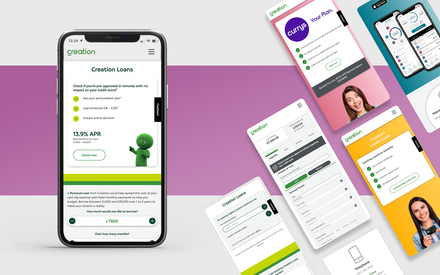
Having tested every single component for compatibility, we subsequently implemented updates to enhance their usability. This included:
- Ensuring that all form elements were appropriataely connected with aria-describedby attributes to provide error descriptions.
- Making sure that drop-down menues and checkboxes could be easily navigated and operated using only a keyboard.
- Ensuring that help was easily and readily available when required, and that it was available to assistive technology users – it is easy to overlook that help that is only available via hover, or pictures of how you are meant to fill it in with no text alternative for screen readers could cause frustration and errors.
- Adding in bypass blocks to allow keyboard and assistive technology users to skip large blocks of repeated content.
- Ensuring that pages and content were adequetly identifiable, with descriptive page titles and logical, informative headings.
In some cases this involved updating existing components to work better with assistive technologies, and in others it meant redesigning pages and components to work better for more people.
Template redesign
To maintain a consistent and user-friendly design across the entire website, we redesigned the page templates. These updates were meticulously crafted to ensure that not only the current pages but also future additions would adhere to WCAG standards, thus guaranteeing an inclusive experience for all users. This also worked for us, allowing us to build pages and add content faster and more easily than before!
Rechecking
Upon implementing these improvements, we conducted a comprehensive reassessment of the entire website and updated our accessibility report of the site. This final testing phase was crucial in ensuring the whole site was fully accessible, and involved manually testing each page to ensure they work beautifully with a range of assistive technologies.
Future development
Not only did we achieve the desired WCAG standard for the whole site, but we used this as an opportunity to look at how we could continue to improve for future iterations of the site.
Key features
Final thoughts:
At Haywyre, we believe that digital accessibility isn’t just a checkbox to be marked—it’s a commitment to ensuring that every individual, regardless of their abilities, can engage with the digital world. While we are always proud of the work we put out, it is important to think of continuous improvement, and out accessibility audit exemplifies this. The digital landscape has evolved – as it should – and as software developers it is our duty to ensure that all our work is being updated to meeting these changing social and legal requirements. Looking back on our projects through a new focus such as accessibility allows us to contiuously improve not just our existing work, but future projects as well.
Main benefits of our partnership
- A WCAG 2.1 AA standard website where every page has been tested to the required standard
- Updates to the forms and components improves overall user experience, encouraging repeat custom, user recommendation and enjoyment using the site
- Accessible forms ensures fewer mistakes, saving BNP and the customers time in fixing them
- Reduced risk of legal issues due to mistakes on loan applications
- Alignment with regulatory accessibility requirements
- Increased trust from the consumers
- A continuous improvement culture which drives innovation
- A modern, intuitive design which stands out from the competition
- Improved templates and components ensures new content will be consistent and compliant

I have found their work to be of a high standard and they keep up to date with the latest trends for online behaviour. I know that I will get a quick response to any questions whether I pick up the phone or send an email. […] Haywyre consistently provide creative options for web updates and are equally happy to work alongside other external agencies to make the web content really come to life. […] By having regular conference calls and with extensive use of project management software, updates for all of the projects get progressed with the minimum of fuss. Haywyre are super-responsive and prepared to go the extra mile to get things done in a timely manner.”
Craig, BNP Personal Finance
Read about our accessibility commitment
Can technology support better mental health
Embracing Mental Health Awareness Week with Haywyre! In a world where technology plays an ever-growing role, we explore its impact on mental health in our latest blog post.
Celebrating Neurodiversity Week: Neurodiversity and software development
Digital accessibility has gained increasing prominence, highlighting the need for technology to be inclusive and accessible for all. But this week is not just about raising awareness; it’s about recognising the invaluable contributions of neurodivergent individuals.
Embracing assistive technologies in software design
Haywyre is always improving, and have been looking at new ways acknowledge and support assistive technologies in their software design process.
